News -
Mynewsdesk Reveals New Look Newsroom
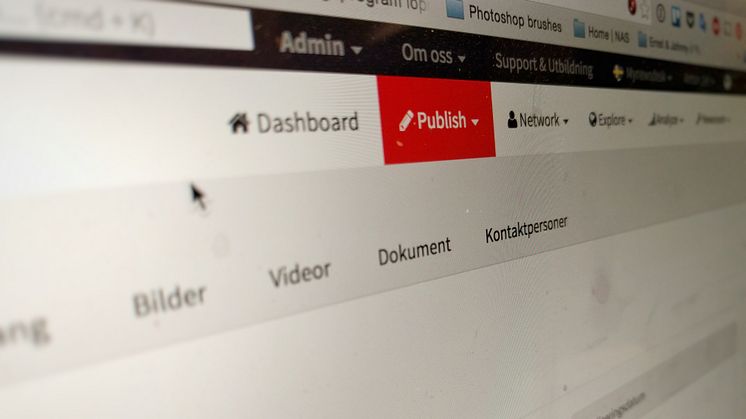
Good news for all of our users! We've JUST rolled out the first part of several major product improvements we have planned for 2016.
As you can see when you log in, we’ve freshened up the design of the entire tool. But don’t worry - all your favourite features are still in the same place as before - but this new look and feel will hopefully enhance the way you use Mynewsdesk.
Here’s our thinking behind it...
The first step...
Our users always come first. That’s why we’ve implemented a modern framework for web development that helps us build faster high-end features, swiftly.
The first step of this implementation is the updated design of our product. We’ve created a more unified interface that will allow us to continue working on an effective tablet and mobile phone experience. We're always working on new, more flexible ways of working with the tool, and that includes using Mynewsdesk on-the-go.
But it doesn’t stop here. We’ll continue to augment designs and features throughout the year in order to provide the best possible experience.
The next steps...
You’re probably curious about the other major improvements in store for 2016…? Well, we’re very excited to be working on these as you read this, but we don’t want to give away too much...just yet! What we can tell you is that in the coming months, we’ll be working very hard to deliver improved analytics, better reach, and more powerful publishing features.
Later this year, we’ll also look into improving our pricing structure to better suit our customers’ needs, as well as to prevent steep price increases in the future.
Stay tuned!
See any bugs?
We’d love for all updates to happen flawlessly - but we’re only human, we make mistakes! If you see anything happen that shouldn’t happen while you’re using our product, don’t hesitate to report it to our Customer Support team. Use the live chat within the product or contact us via http://www.mynewsdesk.com/support.


