News —
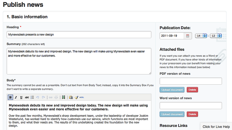
Mynewsdesk presents a new design
Mynewsdesk debuts its new and improved design today. The new design will make using Mynewsdesk even easier and more effective for our customers.
Over the past few months, Mynewsdesk's sharp development team, under the leadership of developer Joakim Westerlund, has worked hard to identify how customers use our service, which functions are most important to them, and what their needs are. The results of this undertaking created the foundation for the new design.
”We have over 3,000 active customers using our services every day. We see it as an important challenge to further facilitate ”ease of use” for them by providing a clearer design and more intuitive navigation,” says Joakim Westerlund.
Intuitive navigation and improved work flow
With its new design, Mynewsdesk offers even easier use of its PR services, with a clearer overview of the different functions. All the functions are still there, but are improved and will create a simpler and more effective workflow. The newsroom and mynewsdesk.com will keep their current look.
To offer a world-class PR service is not enough. Mynewsdesk wants to look good too. We hope that users find the new design stylish, fresh, and easy to use.
The work has just begun
Mynewsdesk is a leader in an innovative industry and is constantly upgrading its services in digital and social marketing. The new design is not the end of a project, but rather a first step.
”Design and usability are the key focus areas for us and that will continue to be so in the future. The new design will also make it easy to integrate new services as they are developed,” says Joakim Westerlund.
